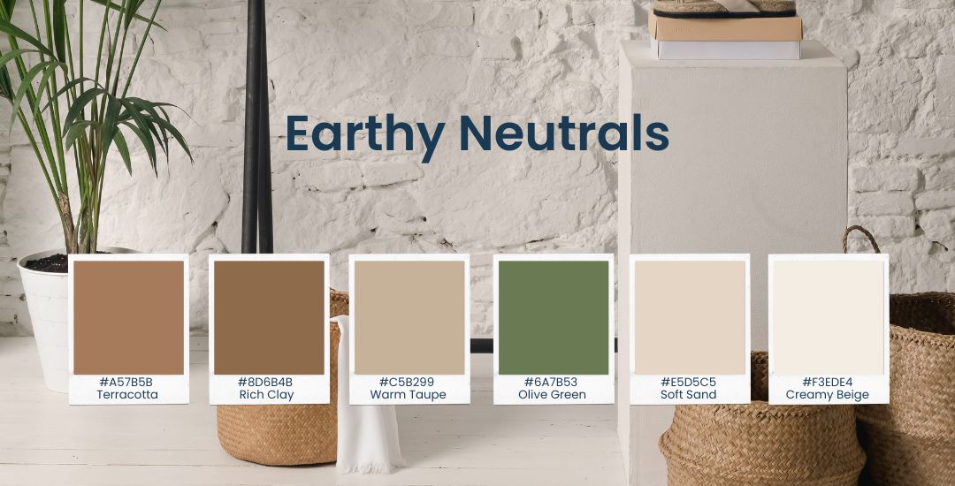
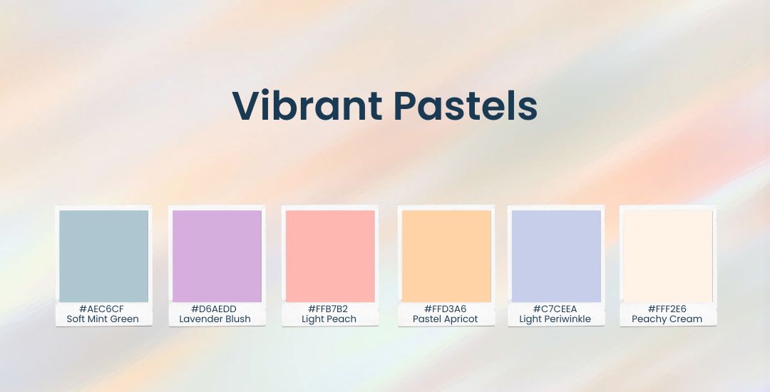
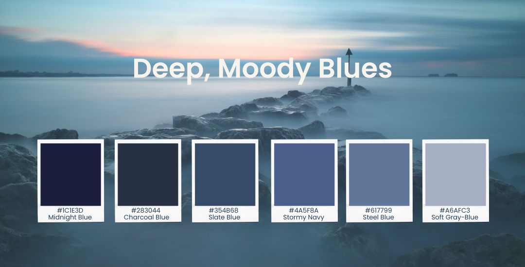
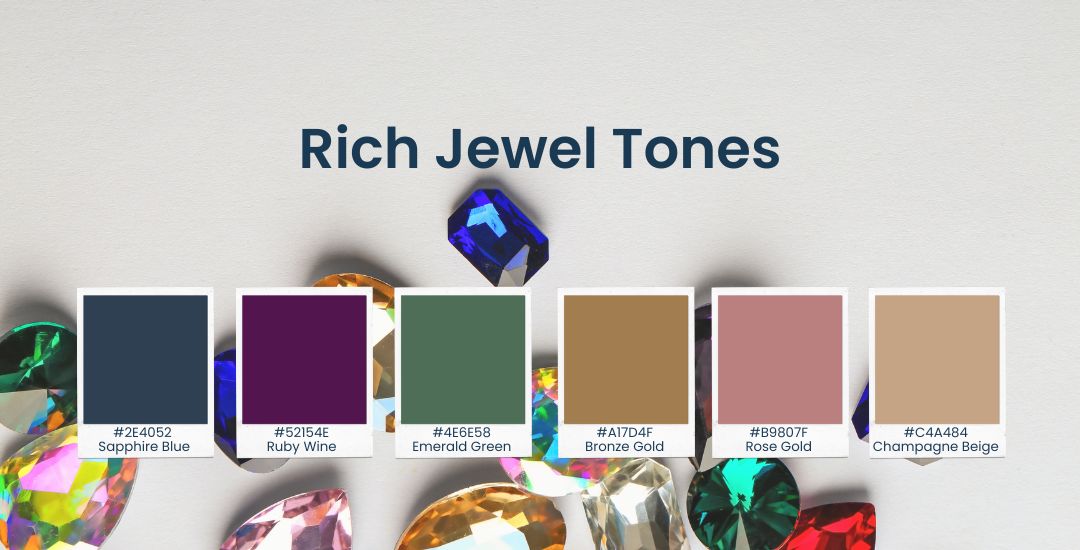
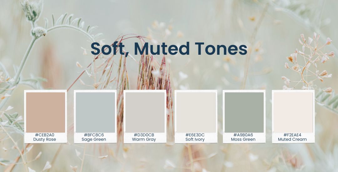
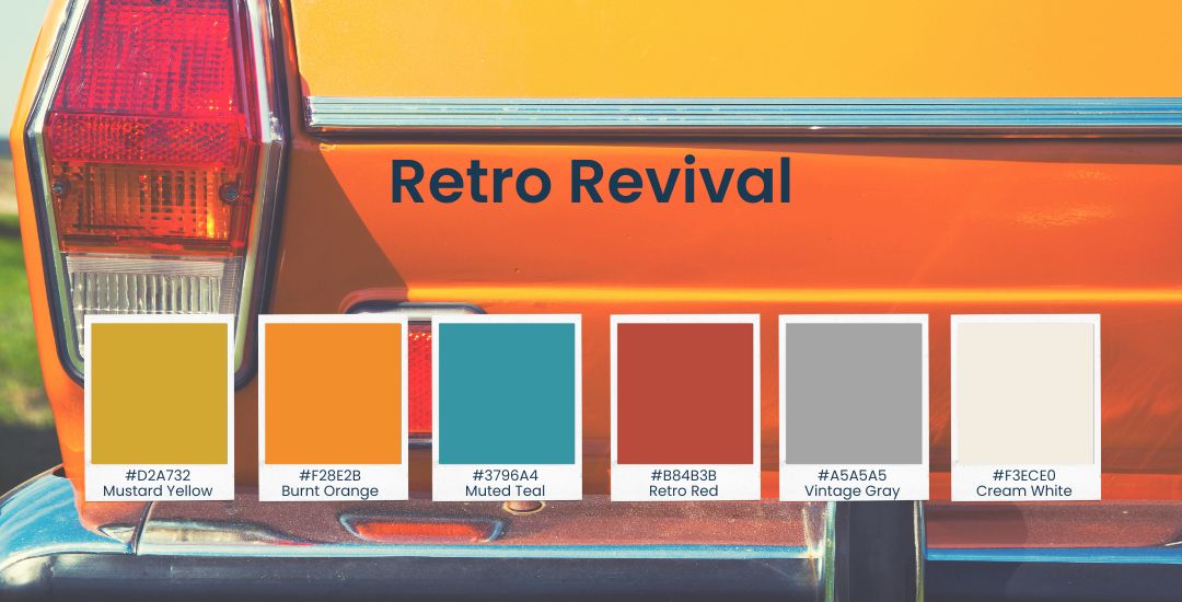
10 Trending Color Palettes for 2025: Elevate Your Brand and Website with Modern Style
![](https://qawebstudio.com/wp-content/uploads/2021/08/LUXURY-COLOR-PALETTES.jpg)
As we move towards 2025, color trends continue to evolve to reflect the values and aspirations of today’s consumers. For local small businesses, staying current with these trends is essential not only to attract attention but also to foster emotional connections, communicate brand values, and stand out in a competitive market.
A well-curated color palette does more than catch the eye; it can tell a story, evoke emotions, and make a memorable impact. In this guide, we’ll explore 10 color palettes predicted to be popular in 2025, along with practical tips on how to implement them effectively in both online and offline branding.
1. Earthy Neutrals: Embracing Sustainability and Authenticity
Earthy neutrals, such as terracotta, olive green, and warm taupe, symbolize a commitment to sustainability and authenticity. These colors create a natural and grounded vibe, ideal for brands that prioritize eco-consciousness and transparency.
Color Palette For Earthy Neutrals:
#A57B5B (Terracotta) | #8D6B4B (Rich Clay) | #C5B299 (Warm Taupe) |
#6A7B53 (Olive Green) | #E5D5C5 (Soft Sand) | #F3EDE4 (Creamy Beige)
Implementation Tips:
- Website: Use earthy neutrals for backgrounds to create a warm and inviting feel. Pair these tones with off-white or beige text to maintain readability while reinforcing a natural aesthetic.
- Social Media: Showcase your products in natural settings or incorporate these tones into your graphics to enhance an eco-friendly brand image.
- In-Store: Earthy neutrals are perfect for decor, from wall colors to signage, creating a calming and welcoming atmosphere.
Real-World Example: A local organic grocery store could use earthy neutrals in its branding to underscore its commitment to sustainability, attracting eco-conscious consumers and enhancing its authentic appeal.
2. Vibrant Pastels: Adding a Playful and Optimistic Touch
Vibrant pastels—think mint green, soft lavender, and peach—are a modern twist on traditional pastels. These colors convey playfulness and optimism, making them perfect for businesses targeting a youthful or family-friendly audience.
Color Palette For Vibrant Pastels:
#AEC6CF (Soft Mint Green) | #D6AEDD (Lavender Blush) | #FFB7B2 (Light Peach) |
#FFD3A6 (Pastel Apricot) | #C7CEEA (Light Periwinkle) | #FFF2E6 (Peachy Cream)
Implementation Tips:
- Website: Incorporate vibrant pastels in headers, buttons, and banners to create a welcoming and approachable vibe. They work well as accents against a neutral background.
- Social Media: Use pastel tones in product photos and promotional graphics to convey excitement, positivity, and warmth.
- Packaging: Pastel colors are especially effective for products aimed at children or young families, as they evoke a sense of joy and softness.
Real-World Example: A local bakery could use vibrant pastels in its branding to create a cheerful identity, appealing to families and young adults looking for a cozy spot to enjoy treats.
3. Deep, Moody Blues: Conveying Trust and Professionalism
Deep blues, such as navy and midnight blue, convey sophistication, trust, and reliability. This palette is ideal for businesses aiming to present a professional and stable image, as these colors evoke feelings of depth and strength.
Color Palette For Deep, Moody Blues:
#1C1E3D (Midnight Blue) | #283044 (Charcoal Blue) | #354B68 (Slate Blue) |
#4A5F8A (Stormy Navy) | #617799 (Steel Blue) | #A6AFC3 (Soft Gray-Blue)
Implementation Tips:
- Website: Use deep blues for navigation bars and call-to-action (CTA) buttons to create contrast and guide the user’s eye effectively.
- Social Media: Incorporate moody blues in content that shares your brand values or tells a meaningful story, adding a touch of seriousness and trust.
- Business Cards: Deep blues add a professional feel to business cards and other printed materials, leaving a lasting impression on potential clients.
Real-World Example: A local bookshop might use deep blues in its decor and branding to evoke wisdom and a sense of tradition, appealing to intellectuals and avid readers.
4. Sunset Hues: Inspiring Adventure and Wonder
Sunset-inspired colors—such as shades of pink, orange, and purple—are warm, vibrant, and inspiring. They’re perfect for brands that aim to encourage exploration, wonder, and emotional connections.
Color Palette For Sunset Hues:
#F2665A (Sunset Coral) | #E5979E (Dusty Pink) | #FFCCAA (Warm Peach) |
#F49E4C (Soft Tangerine) | #D9736D (Burnt Rose) | #FFE5D4 (Pale Apricot)
Implementation Tips:
- Website: Use sunset hues for CTA buttons or highlights to encourage user engagement and create an energetic vibe.
- Social Media: Use these colors in visually striking images and videos to capture your audience’s attention and evoke feelings of inspiration.
- Marketing Materials: For event promotions, sunset hues can evoke excitement and anticipation, motivating customers to join in.
Real-World Example: A local travel agency could use sunset hues in their branding to inspire wanderlust, motivating customers to explore new destinations and connect with their adventurous side.
5. Minimalist Black and White: Timeless Elegance
Black and white remains a classic, minimalist combination that radiates timeless elegance. This palette is suitable for brands that prioritize sophistication, simplicity, and versatility.
Color Palette For Minimalist Black and White:
#000000 (Deep Black) | #1C1C1C (Charcoal) | #666666 (Warm Gray) |
#EDEDED (Light Gray) | #FFFFFF (Pure White) | #B2B2B2 (Muted Silver)
Implementation Tips:
- Website: A monochrome scheme can create a sleek, modern look. Use high-quality images and minimalist icons to add texture and interest.
- Social Media: Maintain a cohesive feed using black and white filters, which are especially effective for brands in the fashion or luxury industries.
- Packaging: Black and white packaging speaks to quality and precision, giving products a high-end feel.
Real-World Example: A local boutique could use black and white for its branding to highlight the quality and sophistication of its products, appealing to an audience with refined tastes.
6. Neon Accents: Making a Bold Statement
Neon colors, like electric blue, neon green, and hot pink, are back in 2025. These accents are bold and eye-catching, perfect for brands that want to stand out and create a strong visual identity.
Color Palette For Neon Accents:
#2FF3E0 (Electric Mint) | #FBFF12 (Neon Yellow) | #FF5D73 (Neon Coral) |
#20D6A5 (Lime Green) | #FF007F (Hot Pink) | #EEF9F1 (Soft Mint Background)
Implementation Tips:
- Website: Use neon accents for CTAs, icons, or highlight features, adding a pop of color without overwhelming the design.
- Social Media: Neon accents can add energy to your posts, ideal for product launches, special announcements, or sales.
- Outdoor Signage: Neon colors are attention-grabbing, making them ideal for storefront signage that needs to attract passersby.
Real-World Example: A local gym could use neon accents to convey energy and motivation, drawing in clients who are excited to stay active and engaged.
7. Rich Jewel Tones: Exuding Luxury and Quality
Jewel tones, including emerald green, ruby red, and sapphire blue, convey a sense of luxury, exclusivity, and quality. These colors are ideal for premium brands that want to showcase their high standards.
Color Palette For Rich Jewel Tones:
#2E4052 (Sapphire Blue) | #52154E (Ruby Wine) | #4E6E58 (Emerald Green) |
#A17D4F (Bronze Gold) | #B9807F (Rose Gold) | #C4A484 (Champagne Beige)
Implementation Tips:
- Website: Use jewel tones to highlight premium products or sections, creating an upscale look that differentiates the brand.
- Social Media: Feature jewel tones in announcements or exclusive offers to create a sophisticated atmosphere.
- In-Store Decor: Jewel tones can be used in upholstery, wall accents, or lighting to give a high-end, luxurious feel.
Real-World Example: A local jewelry store could use jewel tones to reflect the quality and craftsmanship of its products, appealing to customers who seek unique, high-quality pieces.
8. Soft, Muted Tones: Evoking Calm and Mindfulness
Soft, muted tones like dusty rose, sage green, and light gray create a calming effect, making them perfect for brands that want to emphasize wellness, mindfulness, and relaxation.
Color Palette For Soft, Muted Tones:
#CEB2A0 (Dusty Rose) | #BFC8C6 (Sage Green) | #D3D0CB (Warm Gray) |
#E6E3DC (Soft Ivory) | #A9B0A6 (Moss Green) | #F2EAE4 (Muted Cream)
Implementation Tips:
- Website: Use muted tones for backgrounds and overlays to create a serene browsing experience that encourages users to stay longer.
- Social Media: Develop content that conveys peace and calm, resonating with audiences interested in mindfulness and self-care.
- Store Decor: Use soft, muted colors in your store to create a peaceful shopping environment that encourages relaxation.
Real-World Example: A local yoga studio might use soft, muted tones in its branding to attract customers looking to unwind, relax, and practice mindfulness.
9. Retro Revival: Tapping into Nostalgia
Retro colors like mustard yellow, burnt orange, and teal are making a comeback, inspired by the 70s and 80s. These hues evoke nostalgia and resonate with customers across generations.
Color Palette For Retro Revival:
#D2A732 (Mustard Yellow) | #F28E2B (Burnt Orange) | #3796A4 (Muted Teal) |
#B84B3B (Retro Red) | #A5A5A5 (Vintage Gray) | #F3ECE0 (Cream White)
Implementation Tips:
- Website: Use retro colors in graphics, banners, and icons to evoke a vintage feel.
- Social Media: Share throwback content and engage audiences with nostalgic themes that create a fun and memorable connection.
- Interior Design: Retro colors work well in cafes and diners, providing a unique atmosphere that feels both familiar and distinctive.
Real-World Example: A local diner might adopt a retro color palette to create a nostalgic dining experience, drawing in customers who appreciate the classic vibe.
10. Metallics and Shimmers: Adding a Touch of Glamour
Metallic shades like gold, silver, and bronze add a sense of glamour and exclusivity. Perfect for upscale branding, metallics can make a business stand out by conveying sophistication and high-end appeal.
Color Palette For Metallics and Shimmers:
#D4AF37 (Gold) | #A7A9AC (Silver) | #B08D57 (Bronze) |
#B76E79 (Rose Gold) | #F7E7CE (Champagne) | #8E8E93 (Pewter)
Implementation Tips:
- Website: Use metallics as subtle accents to add a touch of luxury without overwhelming the design.
- Social Media: Metallic graphics in promotional posts can elevate the perceived value of your products and services.
- Packaging: Metallic accents in packaging catch the light, adding a premium feel that makes products more enticing.
Real-World Example: A local event planning business might use metallics in its branding to reflect elegance and sophistication, attracting clients looking for high-end services.
Colors as a Powerful Tool for Local Small Businesses
Colors are a powerful branding tool that can impact customer perception and influence purchasing decisions. By embracing these color trends, local small businesses can elevate their brand presence, connect with their communities, and stand out in competitive markets.
Choosing the right colors isn’t just about aesthetics—it’s a strategic decision that reinforces brand values, builds customer loyalty, and strengthens community bonds. Supporting local small businesses through thoughtful color choices not only enhances visibility but also contributes to thriving local economies. By staying on top of these trends, small businesses can create memorable brand experiences that resonate with their customers and foster lasting relationships.